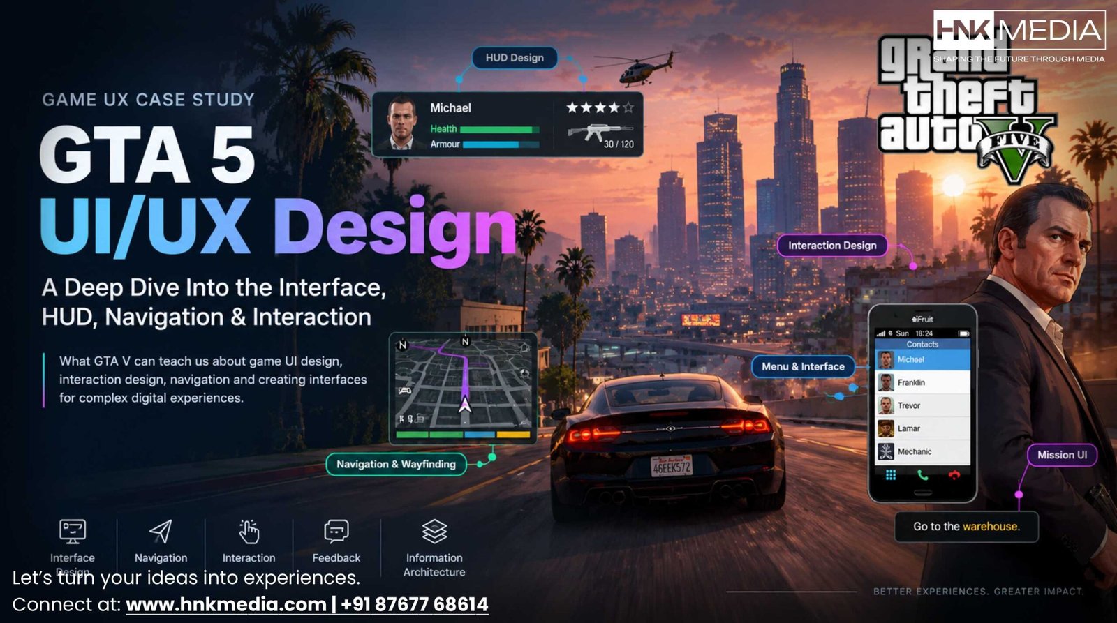
GTA 5 UI/UX Design: A Deep Dive Into the Interface, HUD, Navigation & Interaction
Published on October 7, 2026 by Sanaullah Khan
What GTA V can teach us about game UI design, interaction design, navigation, and creating interfaces for complex digital experiences
When we talk about GTA 5, most conversations focus on its open world, missions, characters, vehicles, and gameplay.
But there is another layer that players interact with almost constantly: the user interface.
The mini-map tells players where they are going. The HUD communicates important game information. Menus organize settings and options. Notifications provide feedback. Control prompts explain available actions.
Together, these elements create the GTA V UI/UX experience.
From a UX perspective, GTA V is an interesting example because it has to communicate a large amount of information without completely taking the player out of the game.
The challenge is simple to describe:
How can a game provide the right information at the right time without making the interface feel like the main experience?
This case study looks specifically at GTA 5 UI/UX design, including the HUD, mini-map, menus, navigation, interaction patterns, feedback, and information hierarchy.
For a broader analysis of player behaviour, personas, cognitive load, and player experience, see our GTA V UX Research case study.
1. GTA 5 UI vs UX: What’s the Difference?
Before looking at the interface, it is useful to separate UI from UX.
UI — User Interface
UI is what the player sees and interacts with.
In GTA V, this includes:
Mini-map
Health and armour indicators
Wanted level
Weapon information
Ammunition
Mission notifications
Menus
Icons
Navigation markers
Control prompts
UX — User Experience
UX is the larger experience created by those interfaces and interactions.
It includes:
How easily players understand the system
How quickly they find information
How they navigate the world
How they learn controls
How they respond to feedback
How much effort an interaction requires
Whether players feel in control
A simple way to think about it is:
UI = What the player interacts with
UX = How the entire interaction feels and works
The distinction matters because a visually attractive interface can still create a poor user experience.
2. The Core UX Challenge Behind GTA V’s Interface
GTA V is a complex interactive system.
A player may need information about:
Location
Direction
Mission objectives
Health
Armour
Weapons
Ammunition
Wanted status
Vehicles
Activities
Notifications
Controls
Displaying everything permanently would create visual overload.
Displaying too little information would make the game difficult to understand.
This creates a classic UX problem:
How much information should be visible, and when should it appear?
GTA V approaches this by giving different types of information different levels of visibility.
Some information remains available during gameplay.
Other information appears only when it becomes relevant.
This is an important principle in game UI design and digital product design generally:
Not every piece of information needs to be visible at the same time.
3. Understanding the GTA V HUD
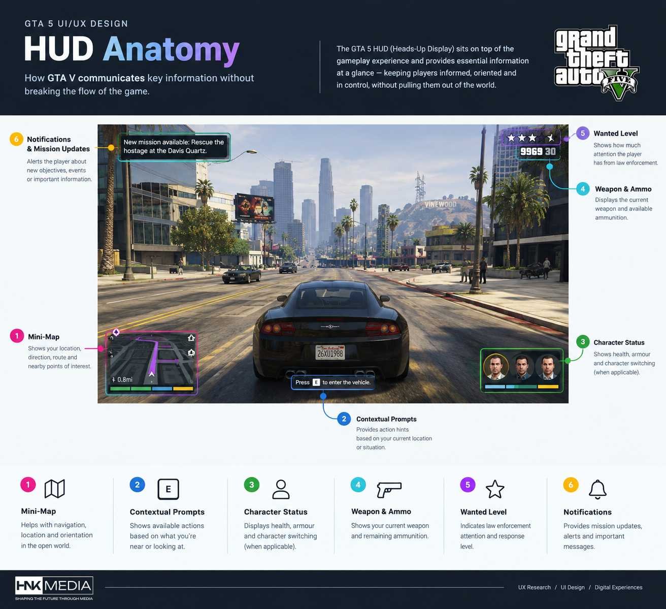
The HUD, or Heads-Up Display, is one of the most important parts of the GTA 5 interface.
It sits on top of the gameplay experience and provides information without requiring the player to open a separate screen.
The HUD can communicate information such as:
Mini-map
Player status
Health
Armour
Weapon
Ammunition
Wanted level
Notifications
Mission information
The value of a HUD is not simply the amount of information it contains.
Its value comes from how quickly the player can understand that information while continuing to play.
This makes the HUD a good example of information hierarchy.
4. Visual Hierarchy in GTA 5 UI
Imagine the player is driving at high speed.
They do not have time to stop and carefully read a dashboard.
The interface therefore needs to support quick recognition.
Information can be thought of in three broad levels.
High-priority information
Information that may affect an immediate decision.
Examples:
Navigation
Wanted status
Health
Weapon
Ammunition
Contextual information
Information that becomes useful during a specific situation.
Examples:
Mission instructions
Interaction prompts
Notifications
New objectives
Secondary information
Information that does not need constant attention.
Examples:
Detailed statistics
Settings
Progress information
Some optional activities
This hierarchy reduces unnecessary visual competition.
The player can focus on the world while still having important information available.
GTA 5 UI/UX Design: A deep dive into the interface, HUD, navigation and interaction
5. GTA 5 Mini-Map UX
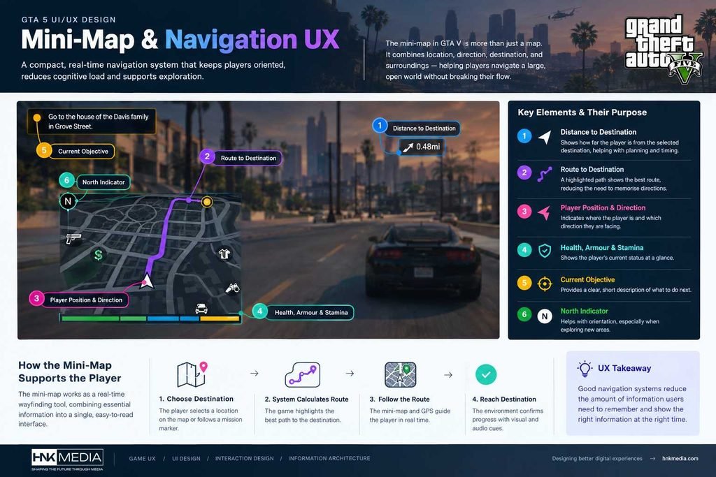
The mini-map is arguably one of the most important interface components in GTA V.
It acts as a navigation tool, location indicator, and contextual information layer.
It helps answer questions such as:
Where am I?
Which direction am I facing?
Where is my destination?
Where is the road?
Where is the next turn?
What important locations are nearby?
Instead of forcing the player to open the full map every few seconds, GTA V keeps a compact navigation layer available during gameplay.
This is a strong example of contextual information.
6. The Mini-Map as a Wayfinding System
The mini-map is not just a map.
It is a wayfinding interface.
The system connects the player’s current position with a destination and provides visual guidance.
A simplified journey looks like this:
Player selects destination
↓
System calculates route
↓
Route appears on map
↓
Player follows visual guidance
↓
Environment confirms progress
This reduces the need for the player to remember a route.
The interface does part of the cognitive work.
That is an important UX principle:
Good navigation systems reduce the amount of information users have to remember.
7. GPS and Real-Time Navigation
GTA V’s navigation system is especially useful during driving.
The player can focus on driving while the interface communicates route information.
This creates a division of attention:
Primary task: Drive
Supporting task: Understand navigation
The interface supports the primary activity instead of forcing the player to leave it.
This same principle appears in other products.
For example:
Google Maps while driving
Automotive dashboards
Delivery applications
Fitness applications
Airport navigation
Warehouse systems
The lesson is not simply “use a map.”
The lesson is:
Put supporting information close to the user’s primary task.
8. GTA 5 Menu Design
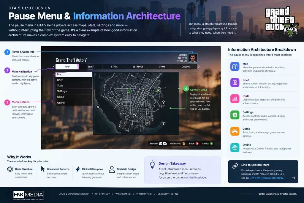
The GTA V pause menu is another important part of the interface.
The menu provides access to areas such as:
Map
Brief
Stats
Settings
Game
Online
Rockstar’s support documentation confirms that settings can be accessed from the Pause Menu in both Story Mode and Online, with categories including controls, audio, camera, and display.
From an information-architecture perspective, this creates a clear separation between:
Gameplay
and
System-level information and controls
This distinction is useful because players should not have to manage every setting while actively playing.
9. Information Architecture in GTA V
A complex game needs a strong information architecture.
The player interacts with different systems, but those systems cannot all appear at the same level.
A simplified structure looks like:
Gameplay
→ HUD → Navigation → Objectives → Interaction
World
→ Locations → Activities → Missions → Characters
System
→ Settings → Controls → Display → Audio → Camera
Progress
→ Stats → Game information → Mission progress
This type of structure helps users create a mental model of the product.
The same principle applies to websites and applications.
If everything is placed at the same level, users have difficulty understanding where things belong.
10. Interaction Design in GTA 5
Interaction design is about more than buttons.
It is about the relationship between:
User intention → Action → System response
For example:
Player wants to drive
→ Approaches vehicle
→ Enters vehicle
→ Control system changes
→ Driving interface becomes relevant
The player does not need to manually navigate through a separate “vehicle mode.”
The interaction is contextual.
This is a useful UX pattern:
Change the interface according to what the user is trying to do.
11. Contextual Controls
GTA V uses contextual interactions throughout the experience.
The controls required for walking are not the same as those required for driving.
Driving introduces different interactions.
Combat introduces another set.
Swimming introduces another.
Menus introduce another.
This could become overwhelming if every possible control were shown simultaneously.
Instead, the interface generally focuses on the actions relevant to the current context.
This is another example of progressive disclosure.
Users see more information when they need it.
12. Feedback Design
Every interaction needs feedback.
Without feedback, users may wonder:
Did the system understand what I just did?
GTA V uses several feedback channels.
Visual feedback
HUD changes
Icons
Notifications
Mission updates
Animation
Map changes
Audio feedback
Sound effects
Character dialogue
Environmental sounds
Alerts
Interaction feedback
Controller vibration
Changes in movement
Vehicle response
Weapon response
Using multiple channels makes the system easier to understand.
The player does not have to depend on text alone.
13. Notifications and Temporary Information
Notifications are useful because not every piece of information deserves permanent screen space.
A notification can communicate:
A new objective
A mission update
A system event
A gameplay instruction
A change in status
Once the information is no longer important, it can leave the primary interface.
This creates a useful UX pattern:
Appear when relevant → communicate → disappear
This is especially useful in products where users are already focused on another task.
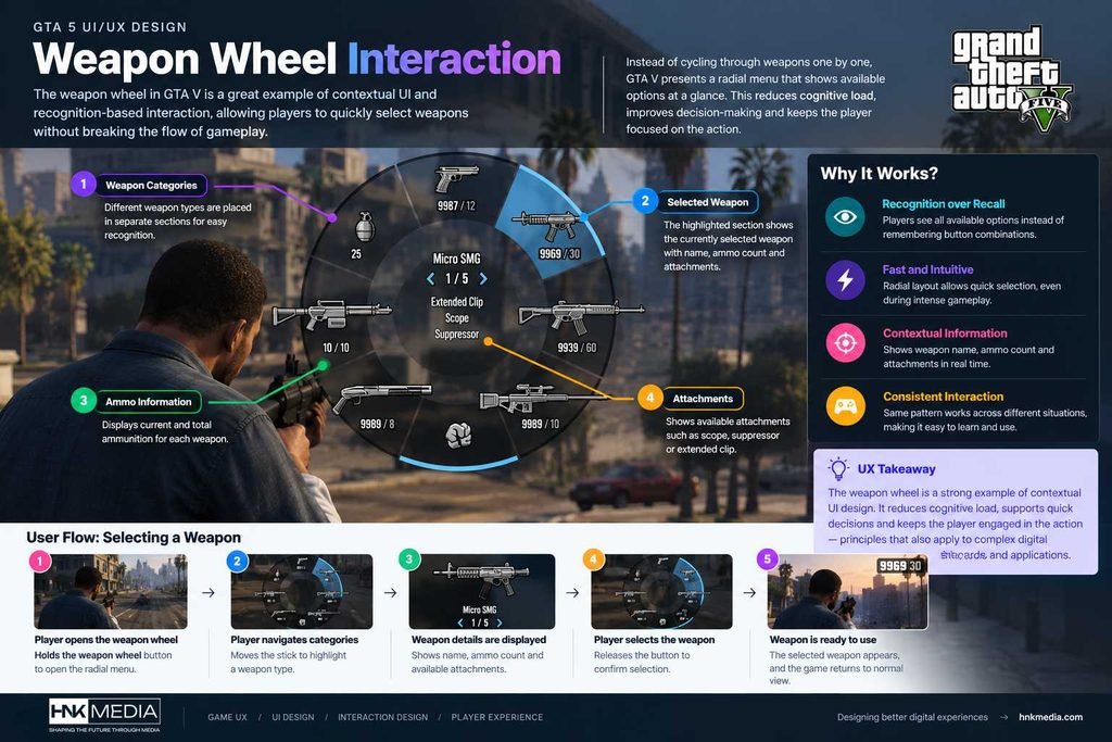
14. Weapon Wheel UX
The weapon wheel is another useful example of interaction design.
Instead of requiring the player to cycle through weapons one by one, the interface creates a visual selection space.
The player can see categories and make a selection.
From a UX perspective, this can be understood as:
Recognition rather than recall
Instead of asking:
“Which button sequence selects this weapon?”
the interface lets the player visually identify the available options.
That reduces memory requirements.
This principle is widely used in modern interfaces.
Whenever possible:
Show users their options instead of making them remember hidden commands.
15. Phone Interface as a Secondary UI Layer
GTA V’s phone creates another interface inside the game.
The player can access:
Contacts
Messages
Applications
Internet
Other game-related features
This is an interesting example of embedded interface design.
Instead of every interaction being presented through the main HUD, some functionality is moved into a dedicated object.
This creates a layered experience:
Game world
→ Character
→ Phone
→ Phone interface
It also supports the fiction of the game world while giving the designers another place to organize functionality.
16. Diegetic vs Non-Diegetic UI
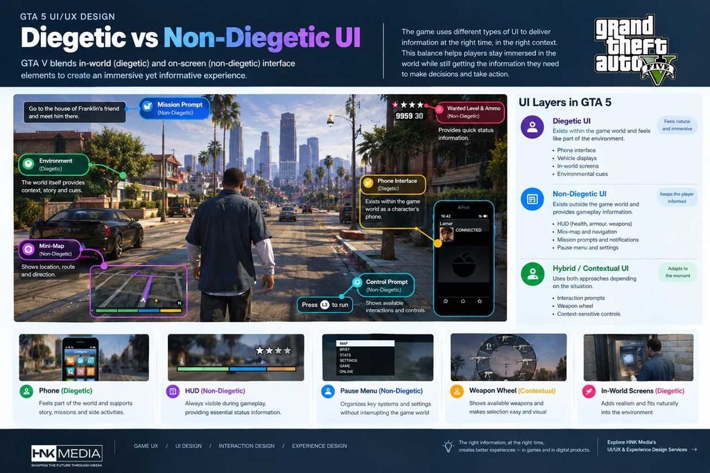
Game UI can generally be divided into different types.
Diegetic UI
The interface exists as part of the game world.
For example:
Phone
In-world screens
Vehicle displays
Non-diegetic UI
The interface exists outside the game world.
For example:
HUD
Mini-map
Notifications
Pause menus
Why this matters
Different interface types affect immersion differently.
A diegetic interface can feel like part of the world.
A non-diegetic interface can provide information more efficiently.
The UX challenge is choosing the right approach for the information being communicated.
17. Consistency in GTA V
Consistency is one of the basic principles of good interface design.
When users understand one interaction pattern, they can often apply that knowledge elsewhere.
In GTA V, recurring elements such as:
Icons
Navigation markers
Notifications
Menu structures
Control prompts
help create familiarity.
This reduces the need to relearn the interface repeatedly.
The principle is simple:
Once users learn a pattern, don’t make them learn it again without a good reason.
18. Cognitive Load and Game UI
A player is already processing a lot of information.
They may be:
Driving
Watching traffic
Following GPS
Listening to dialogue
Looking for enemies
Managing health
Reading an objective
Adding too many interface elements can increase cognitive load.
GTA V therefore provides information through different channels rather than relying on one screen.
HUD
Mini-map
Audio
Environment
Notifications
Mission design
Together, these form the communication system.
This is an important lesson for product designers:
When an interface becomes complex, consider how information can be distributed across context, interaction, and feedback instead of adding more text.
19. Where GTA V’s UI Can Create Friction
A UX analysis should also look at possible friction points.
The goal is not to say that the interface is simply “good” or “bad.”
Instead, we can identify areas where a modern redesign could be explored.
Menu complexity
A large number of settings and options can increase navigation effort.
Information density
Players may encounter many markers and icons as the world becomes more active.
Discoverability
Some features may require players to already understand the system before they can use them efficiently.
Control complexity
Different contexts require different controls, which can increase the learning curve.
Settings comprehension
Players may understand what a setting is called without fully understanding what changing it will do.
These are useful areas for usability testing.
Rockstar’s support documentation shows that GTAV provides extensive settings for controls, audio, camera, and display, which makes settings UX an important area to examine.
20. What a Modern GTA 5 UI Redesign Could Explore
This is where the analysis can move from observation to design exploration.
The goal is not to redesign GTA V without evidence.
Instead, these are UX hypotheses that could be tested with players.
A. Smarter HUD Visibility
Allow players to choose between:
Full HUD
Contextual HUD
Minimal HUD
This would give users more control over information density.
B. Better Map Filtering
Allow players to quickly filter:
Missions
Shops
Activities
Properties
Services
Collectibles
Social locations
This could reduce map clutter for players who only want specific information.
C. Improved Settings Explanations
Settings could provide short explanations of their effect.
For example:
Camera Sensitivity
Controls how quickly the camera responds to your movement.
A preview could also show the difference between low and high settings.
This follows a simple principle:
Help users understand the consequence before they make a choice.
D. Adaptive Onboarding
New players could receive more guidance.
Experienced players could receive less.
For example:
New player → More explanations
Returning player → Reduced guidance
Experienced player → Minimal interruptions
This would make onboarding more responsive to user familiarity.
21. How I Would Test These UX Ideas
A redesign should not be based only on personal opinion.
If this were a real product-design project, I would validate the ideas through research.
Step 1: User Interviews
Understand how players currently use the interface.
Step 2: Usability Testing
Ask players to complete tasks such as:
Find a specific setting
Change a control
Navigate to a location
Find a mission
Understand a map marker
Step 3: Task Analysis
Measure:
Completion rate
Time on task
Errors
Backtracking
Assistance required
Step 4: Prototype
Create alternative interface concepts.
Step 5: A/B or Comparative Testing
Compare the current experience with the proposed design.
Step 6: Iterate
Use the findings to improve the interface.
This is the difference between:
“I think this UI should change.”
and
“Research shows users struggle with this interaction, so here is a tested solution.”
22. What Product Designers Can Learn From GTA 5 UI
The lessons from GTA V are not limited to gaming.
They apply to any complex digital product.
Lesson 1: Prioritise information
Users should immediately understand what matters now.
Lesson 2: Use context
Show functionality when it becomes relevant.
Lesson 3: Reduce memory requirements
Use visible options and familiar patterns instead of forcing users to remember commands.
Lesson 4: Provide immediate feedback
Every important action should produce understandable feedback.
Lesson 5: Design for different levels of experience
New users and experienced users may need different levels of guidance.
Lesson 6: Don’t confuse more features with better UX
Adding functionality increases the importance of information architecture.
Lesson 7: Test assumptions
A designer’s opinion is not the same as user evidence.
23. What GTA V Can Teach SaaS and Product Designers
Game UX has a surprising connection with SaaS and digital products.
Consider a complex business platform.
It might have:
Dashboard
Analytics
Reports
Settings
User management
Notifications
Search
Integrations
Permissions
Multiple workflows
That is not very different from the problem faced by a complex game.
In both cases, the UX needs to answer:
What can I do?
Where am I?
What should I do next?
What just happened?
How do I undo or change something?
Where can I find the feature I need?
This is why studying game UI/UX design can be valuable for product designers.
The medium is different.
The UX problems are often surprisingly similar.
24. HNK Media Perspective: From Game UX to Digital Product UX
At HNK Media, we look at digital experiences from the same basic perspective: understand the user, understand the problem, structure the experience, design the interaction, and test the result.
The process can include:
UX Strategy
→ User Research
→ Information Architecture
→ User Journeys
→ Wireframing
→ Prototyping
→ UI Design
→ Usability Testing
This approach can be applied to websites, mobile applications, SaaS products, dashboards, and other digital experiences.
If your product has complex workflows, multiple user types, or too much information, the first question should not always be:
“How can we make the interface look better?”
It can be:
“How can we make the experience easier to understand and use?”
That’s where UX strategy and research become valuable.
The GTA 5 UI/UX design is interesting because it has to communicate a large amount of information while keeping the player focused on the game world.
The interface does this through a combination of:
HUD design
Mini-map navigation
Information hierarchy
Contextual controls
Feedback
Notifications
Menus
Visual cues
Audio feedback
Progressive disclosure
The biggest lesson is not that every product should look like a game.
It is that complex products need clear systems for communicating information.
A good interface does not simply display everything.
It helps users understand:
Where they are → What is happening → What they can do → What happens next.
That principle works in games.
It also works in websites, apps, SaaS products, dashboards, and other digital experiences.
Frequently Asked Questions
What is GTA 5 UI/UX design?
GTA 5 UI/UX design refers to the interface and overall interaction experience players have while using the game. It includes the HUD, mini-map, menus, navigation, notifications, controls, feedback, and other interaction systems.
What UI elements are used in GTA 5?
GTA V uses several interface elements, including the mini-map, health and armour indicators, wanted-level indicators, weapon and ammunition information, notifications, mission prompts, menus, and control information.
What is the GTA 5 HUD?
The GTA 5 HUD is the information layer displayed during gameplay. It provides players with important information such as navigation, player status, weapons, ammunition, wanted status, and contextual information.
How does the GTA 5 mini-map work?
The mini-map provides information about the player’s location, direction, roads, destinations, and relevant map markers. It works as a real-time wayfinding tool while the player is moving through the game world.
Why is the GTA 5 mini-map important for UX?
The mini-map reduces the amount of information players need to remember. Instead of memorising routes or repeatedly opening the full map, players receive navigation information while continuing their primary activity.
What can UX designers learn from GTA 5?
UX designers can learn about information hierarchy, contextual interfaces, progressive disclosure, navigation, feedback, recognition over recall, and managing complexity.
Is GTA 5 UI an example of good game design?
GTA V provides useful examples for studying game UI and UX, particularly in navigation, contextual feedback, and information hierarchy. A complete assessment of its usability would require structured user research and testing rather than relying only on visual analysis.
What is the difference between GTA 5 UI and UX?
UI refers to the visible interface elements such as the HUD, mini-map, menus, and icons. UX covers the broader experience of understanding, navigating, interacting with, and learning the game.
Can GTA 5 UX principles be applied to websites?
Yes. Principles such as progressive disclosure, contextual information, clear navigation, feedback, visual hierarchy, and reducing cognitive load can also be applied to websites, mobile applications, SaaS products, and dashboards.
How can I improve the UX of a complex digital product?
Start with user research and task analysis. Identify where users struggle, map their journeys, organize the information architecture, create wireframes and prototypes, and validate the design through usability testing before investing heavily in the final UI.
4.9(13)· Top rated
The team they have very corporative and nice…sohan

 Call 24/7 Hours +91 87677 68614
 Send Us Mail info@hnkmedia.com