GTA V UX Research : Understanding the Player Experience
Published on September 23, 2026 by Sanaullah Khan
How GTA V uses UX design to balance freedom, complexity, navigation, and player control
What happens when you give a user a huge digital world and allow them to decide what to do next?
They can follow a structured journey, explore without a goal, complete tasks, make mistakes, discover hidden features, or simply ignore the path the product expects them to take.
This is one of the most interesting UX challenges in Grand Theft Auto V (GTA V).
At first glance, GTA V may look like a game built mainly around action, storytelling, driving, and exploration. From a UX perspective, however, it is a much more complex digital experience.
The player interacts with maps, missions, characters, vehicles, menus, notifications, controls, objectives, navigation systems, environmental cues, and countless interactive elements.
The challenge is not simply to make all these features available.
The challenge is to make them understandable.
That is why GTA V provides an interesting example of game UX design, interaction design, information architecture, navigation, feedback, and player experience design.
This case study looks at GTA V through a UX research and product-design lens.
The goal is to understand how the experience helps players move from discovering the world to understanding the system and eventually controlling the experience themselves.
1. About This UX Case Study
This is a retrospective UX analysis of GTA V.
Rather than treating the game as a conventional entertainment product, I approached it as a complex interactive system.
The analysis focuses on observable elements of the experience, including:
Player navigation
Map and mini-map
Mission structure
Character switching
Interaction patterns
Onboarding
Feedback
Visual hierarchy
Information architecture
Player freedom
Cognitive load
Discoverability
The purpose is not to rate GTA V as a game.
Instead, the purpose is to ask:
What can UX designers learn from the way GTA V manages a large, complex, user-driven experience?
This distinction is important because good UX research should focus on understanding user behaviour, needs, and interactions rather than simply declaring whether a product is “good” or “bad.”
2. The UX Challenge
Designing for Freedom Without Creating Confusion
One of GTA V’s biggest UX challenges is the amount of freedom given to the player.
The player can move around the world, drive different vehicles, follow missions, explore locations, interact with characters, change activities, and move away from the intended objective.
This creates a basic UX tension:
More freedom can create more complexity.
If the product provides too much guidance, the player may feel restricted.
If it provides too little guidance, the player may become confused.
GTA V therefore needs to constantly balance two opposing needs:
Freedom ↔ Guidance
Exploration ↔ Direction
Complexity ↔ Simplicity
Choice ↔ Clarity
This is similar to challenges faced by other complex digital products.
A SaaS platform, for example, may have hundreds of features. An e-commerce platform may have thousands of products. A banking application may have many financial services.
The UX problem is similar:
How do you expose functionality without overwhelming the user?
3. UX Research Approach
How I Analysed the Experience
I structured the GTA V UX research around six areas.
3.1 Navigation
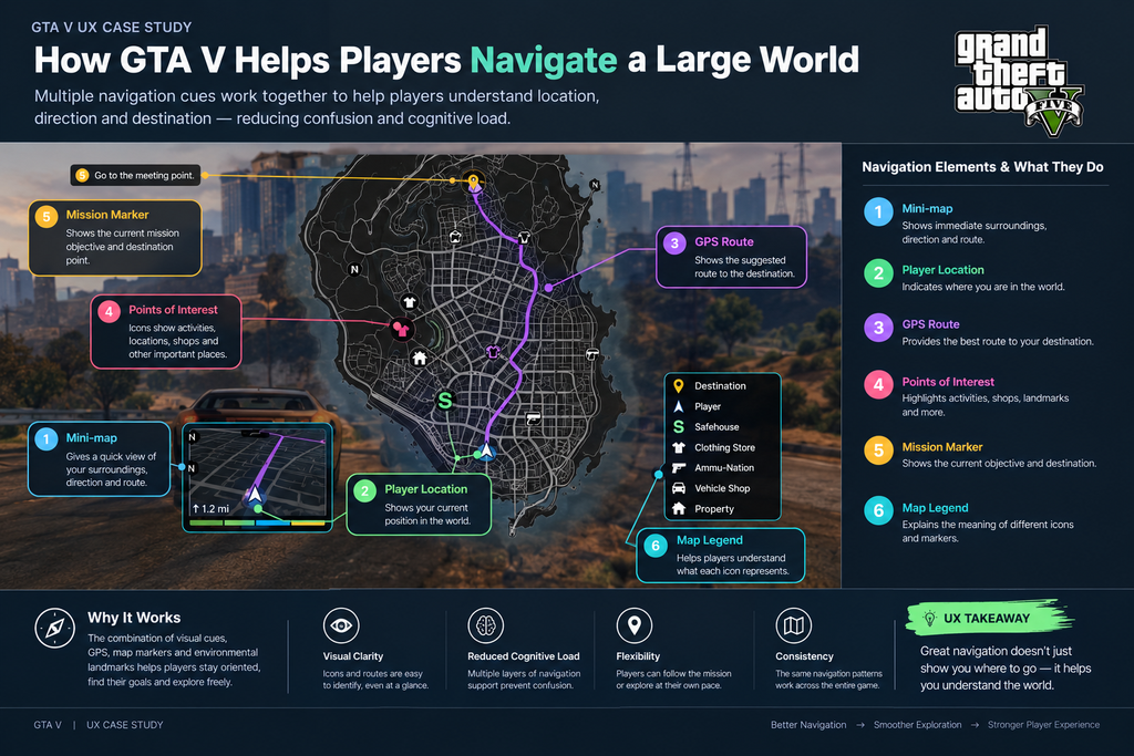
I examined how players understand their location and destination through:
Map
Mini-map
GPS
Route guidance
Mission markers
Location markers
Environmental landmarks
The main question was:
How does the game help players understand where they are and where they need to go?
3.2 Interaction Design
I looked at how players interact with:
Vehicles
Characters
Weapons
Objects
Menus
Phones
Missions
Environmental elements
The goal was to understand how the game communicates available actions.
3.3 Information Architecture
I examined how information is grouped and presented through:
Map categories
Mission types
Menus
Character systems
Activities
Notifications
Objectives
3.4 Feedback
I looked at how the system responds after a player takes an action.
Feedback can include:
Visual changes
Audio responses
Notifications
Mission updates
HUD changes
Character reactions
Status indicators
3.5 Onboarding
I analysed how new systems and mechanics are introduced.
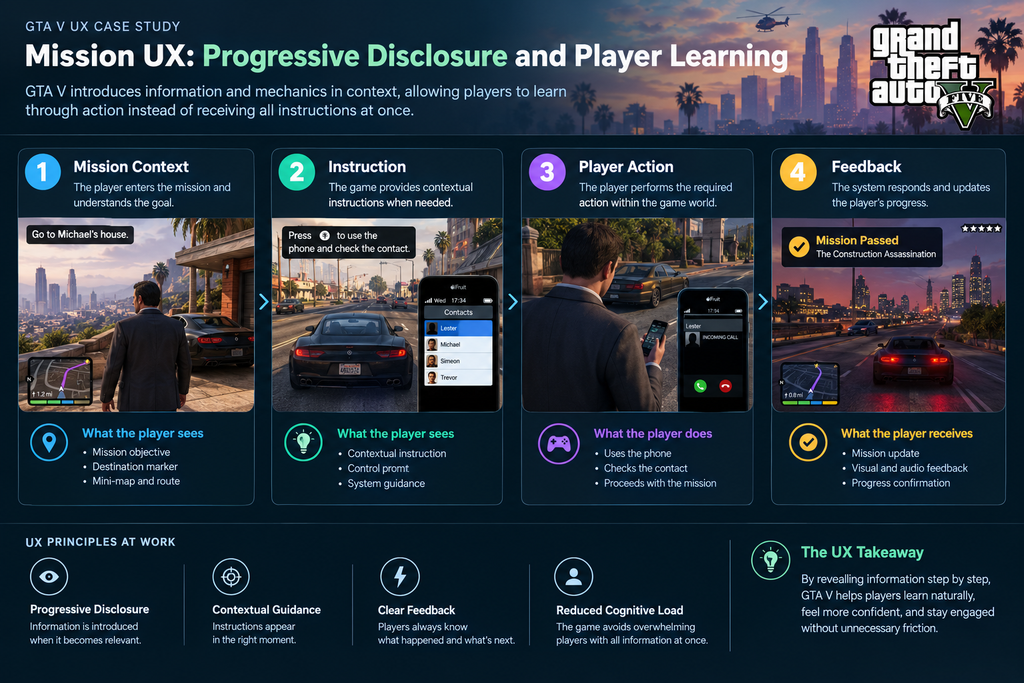
Instead of showing everything immediately, GTA V often introduces mechanics through the progression of gameplay.
This can be connected to the UX principle of progressive disclosure, where secondary or advanced functionality is introduced when it becomes relevant rather than exposing everything at once. Nielsen Norman Group describes progressive disclosure as a way to make complex interfaces easier to learn and less error-prone.
3.6 Player Experience
Finally, I looked at how all these systems work together.
The key question was:
Does the UX help the player feel in control of the experience?
4. Understanding the GTA V Player
One Product, Multiple Player Behaviours
A common UX mistake is to think about “the user” as one person with one goal.
GTA V demonstrates why this can be problematic.
Different players can use the same product in completely different ways.
One player may focus entirely on story missions.
Another may spend hours exploring the map.
Someone else may experiment with vehicles and game mechanics.
A different player may focus on completing activities and collecting everything available.
From a UX perspective, these are different behavioural patterns.
For this case study, I identified five broad player personas.
5. Player Personas
Persona 01: The Story-Driven Player
Primary goal: Complete the narrative.
Typical behaviour:
Follows mission objectives
Uses navigation frequently
Pays attention to characters
Wants clear progression
Usually follows the intended path
Main UX need:
Clear objectives and predictable progression.
The player should understand:
Where do I need to go?
What do I need to do?
What happens next?
Persona 02: The Explorer
Primary goal: Discover the world.
Typical behaviour:
Moves away from missions
Visits unfamiliar locations
Searches for activities
Experiments with the environment
Creates their own objectives
Main UX need:
Orientation without restriction.
This player needs enough information to understand the world but does not necessarily want the product to dictate what happens next.
Persona 03: The Casual Player
Primary goal: Enjoy flexible gameplay.
Typical behaviour:
Plays for shorter sessions
May not remember every control
Moves between activities
Relies on visual cues
Main UX need:
Easy recognition and low learning friction.
The interface should help the player understand important actions without requiring them to remember everything from previous sessions.
Persona 04: The Completion-Oriented Player
Primary goal: Complete activities and progress through available content.
Typical behaviour:
Searches for optional activities
Tracks objectives
Looks for collectibles
Repeats activities
Pays attention to progress
Main UX need:
Discoverability and progress visibility.
The player benefits from clear categories, markers, objectives, and feedback.
Persona 05: The Experimenter
Primary goal: Discover what the system allows.
Typical behaviour:
Tests mechanics
Tries unusual actions
Experiments with vehicles
Interacts with the environment
Often ignores intended objectives
Main UX need:
Predictable feedback with room for experimentation.
This persona is particularly interesting because the player does not always behave as the designer intended.
A strong interactive product must still provide understandable feedback when users take unexpected paths.
6. Player Journey
From Discovery to Mastery
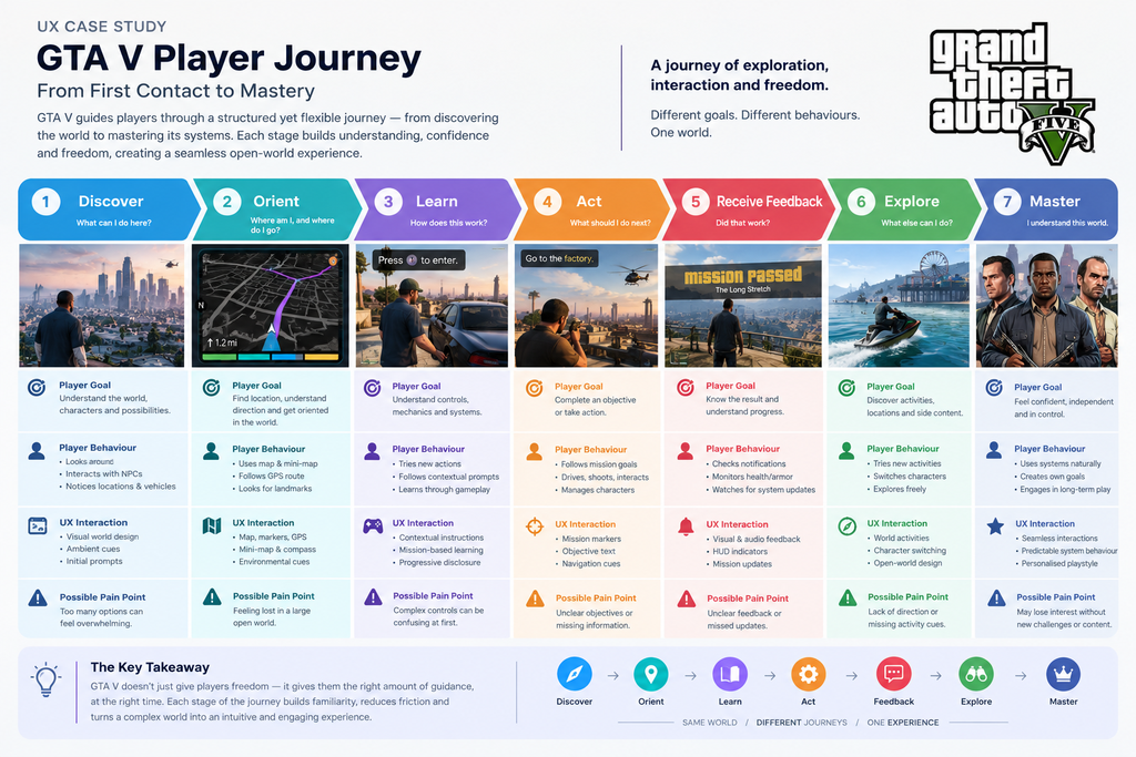
The GTA V player journey can be understood through seven stages:
The player enters a large environment containing characters, locations, vehicles, missions, activities, and interactive elements.
At this point, the world itself becomes part of the onboarding experience.
The player does not need to understand every system immediately.
They first need to understand the basic possibilities.
UX challenge
Too much information at the beginning can create cognitive overload.
UX response
The experience gradually introduces functionality.
This is an example of a broader UX strategy:
Do not explain everything before the user needs it.
8. Stage Two: Orient
Player mindset:
“Where am I?”
Once the player begins moving around the world, orientation becomes important.
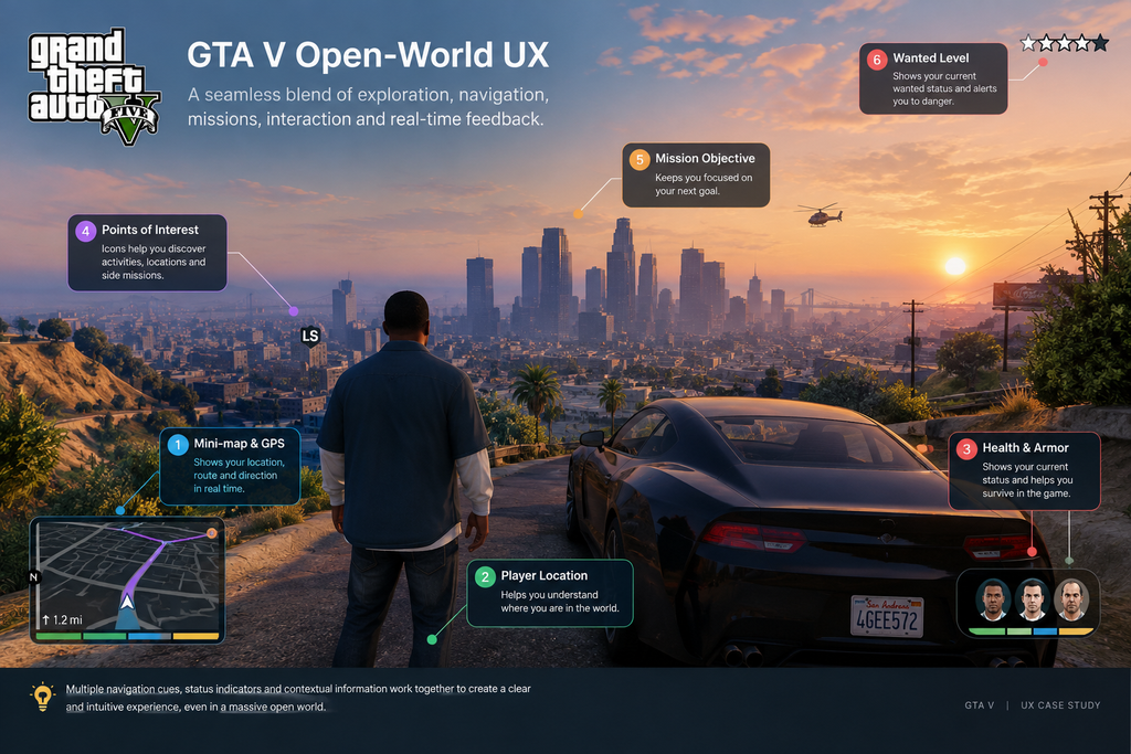
The game uses multiple information layers:
Physical environment
Mini-map
Roads
GPS routes
Mission markers
Location markers
Landmarks
Instead of relying on one navigation mechanism, the experience provides several connected cues.
This creates a useful UX principle:
Users should be able to build an understanding of their environment from more than one source of information.
9. Stage Three: Learn
Player mindset:
“How does this work?”
The player encounters new controls and mechanics during gameplay.
Rather than requiring the player to memorise the entire system before playing, new interactions can become relevant in context.
This is where progressive disclosure becomes useful as a UX lens.
Complexity exists, but it is not always presented at the same time.
The player learns through interaction.
See → Try → Receive feedback → Understand → Repeat
This approach can also be applied outside gaming.
For example, a website or SaaS product can introduce advanced functionality after the user understands the core workflow.
10. Stage Four: Act
Player mindset:
“What should I do?”
The player now needs to complete an action.
That might involve:
Travelling to a destination
Starting a mission
Driving
Interacting with a character
Using an item
Following an objective
The interface needs to provide enough information to make the next action clear.
This is where UX writing, visual hierarchy, navigation, interaction design, and feedback come together.
11. Stage Five: Receive Feedback
Player mindset:
“Did that work?”
A digital system should respond to user actions.
GTA V provides feedback through multiple channels.
For example:
HUD changes
Audio
Notifications
Character responses
Mission updates
Visual effects
Status indicators
Changes in the environment
This connects with the UX principle of visibility of system status.
Nielsen Norman Group identifies visibility of system status as one of the core usability heuristics for interface design.
The important lesson is simple:
When users take an action, they should have enough feedback to understand what happened.
12. Stage Six: Explore
Player mindset:
“What else can I do?”
Once the player understands the basic systems, the experience can become less task-focused.
The player may leave the mission path.
They can explore, experiment. interact with the environment and create their own objectives
This is one of the most important differences between a traditional task-based interface and an open-world experience.
The product does not always need to tell the user what to do.
Sometimes the best UX is giving the user enough information and control to decide what to do next.
13. Stage Seven: Master
Player mindset:
“I know how this works.”
With repeated use, the player develops a mental model of the system.
They understand:
How navigation works
How missions are structured
How controls behave
Where information appears
How feedback works
What different markers mean
How the environment responds
The interface becomes less noticeable because the player no longer needs to consciously think about every interaction.
This is an important UX transition:
Learning the interface → Understanding the system → Using the system naturally
14. Mapping the Complete Player Journey
The overall experience can be represented as:
DISCOVER
↓
ORIENT
↓
LEARN
↓
ACT
↓
RECEIVE FEEDBACK
↓
EXPLORE
↓
MASTER
The interesting part is that the journey is not completely linear.
A player can return to exploration after completing a mission.
They can encounter a new mechanic and return to learning.
They can become confused and return to orientation.
This creates a more realistic model:
Discover ↔ Learn ↔ Act ↔ Feedback ↔ Explore
The player continuously moves between these states.
15. A Key UX Insight
The biggest insight from this research is that GTA V does not treat every UX element as an isolated feature.
The systems work together.
The map supports navigation.
Navigation supports missions.
Missions introduce mechanics.
Mechanics create interaction.
Interaction creates feedback.
Feedback builds understanding.
Understanding enables exploration.
This creates a connected UX ecosystem.
The goal is not simply to reduce complexity.
The goal is to manage complexity at the right moment.
That is a valuable lesson for any digital product.
A website, mobile app, SaaS platform, or e-commerce experience can also contain many features.
The solution is not always removing features.
Sometimes the solution is deciding:
What should the user see now?
Which information is essential for the current task?
What information is needed for the current task?
What can wait until the user asks for it?
16. What UX Designers Can Learn From GTA V
1. Freedom Needs Structure
Giving users freedom does not mean removing all guidance.
Users still need orientation, feedback, and clear interaction patterns.
2. Complexity Can Be Managed
A complex product does not automatically need a simple feature set.
Instead, complexity can be introduced progressively.
This is especially useful for products with advanced functionality. Progressive disclosure is widely used as a way to manage complex interfaces and focus attention on primary actions.
3. Feedback Builds Confidence
When users understand what happened after an action, they can make better decisions.
Good feedback reduces uncertainty.
4. Users Do Not Always Follow the Intended Path
Designers often create an ideal user flow.
Real users may not follow it.
Good UX should consider alternative behaviours instead of assuming every user will follow the expected journey.
5. Navigation Is More Than a Map
Wayfinding can involve:
Visual hierarchy
Spatial relationships
Landmarks
Context
Labels
Routes
Feedback
The best navigation experiences often combine several signals.
17. UX Opportunities
Even a mature product can be analysed for potential UX improvements.
For a future redesign exercise, I would explore areas such as:
Better Activity Discovery
New or returning players may benefit from clearer ways to discover optional activities without making the interface feel crowded.
More Personalised Information
Different players have different priorities.
A more personalised interface could prioritise information based on the player’s current behaviour.
Improved Progress Visibility
Players focused on completion may benefit from clearer progress summaries.
Contextual Assistance
Instead of displaying help continuously, assistance could appear when the system detects that a player may need additional guidance.
These ideas would need to be validated through actual user research before being treated as confirmed usability problems.
That distinction is important.
Observation is not the same as evidence.
A UX case study should clearly separate what was observed from what would need user testing.
18. How This Applies to Digital Product Design
The lessons from GTA V are not limited to games.
The same principles can be applied to websites and digital products.
The UX should support both without overwhelming either user.
Similarly, a business website should not simply display every service, feature, testimonial, and piece of information on the homepage.
It should guide users toward the information that matters at that stage of their journey.
This is where UI/UX design, information architecture, UX strategy, conversion design, and SEO need to work together.
For businesses looking to improve their digital experience, HNK Media provides services across UI/UX design, website design and development, SEO, and digital experience strategy.
One of the most important lessons from this case study is knowing the difference between an observation and a validated research finding.
For example:
Observation: The game uses multiple navigation cues.
UX interpretation: Multiple cues can help players maintain orientation.
Research question: Do players actually find these navigation cues easy to understand?
Validation method: Observe users completing navigation tasks and measure success rate, time, errors, and confusion.
This distinction makes a UX case study stronger.
Instead of saying:
“Players find the map easy to use.”
A responsible UX researcher would say:
“The map provides multiple navigation cues. A usability study would be required to determine how effectively different player groups use them.”
That is the difference between design analysis and user research evidence.
20. Final UX Takeaway
GTA V is an interesting example of how a complex digital experience can give users freedom without removing structure.
The experience does not rely on one UX pattern.
Instead, it combines:
Navigation + Information Architecture + Interaction Design + Feedback + Progressive Learning + Player Freedom
The result is an experience where the player can gradually move from needing guidance to developing their own understanding of the system.
For UX designers, the bigger lesson is not simply:
“Make your product like GTA V.”
The lesson is:
Design the right amount of guidance for the user’s current level of understanding.
New users may need more structure.
Experienced users may want more freedom.
The strongest digital experiences can support both.
Frequently Asked Questions
What is a GTA V UX case study?
A GTA V UX case study examines the game from a user experience and interaction design perspective. It can analyse navigation, player journeys, information architecture, onboarding, feedback, interface design, and player behaviour.
Why is GTA V useful for studying UX design?
GTA V combines a large open world with missions, navigation, character systems, vehicles, menus, interactions, and real-time feedback. This makes it useful for studying how complex interactive systems manage user freedom and guidance.
What can UX designers learn from GTA V?
UX designers can study progressive learning, navigation, contextual feedback, information hierarchy, interaction patterns, user control, and the relationship between structured tasks and free exploration.
What is game UX design?
Game UX design focuses on how players interact with a game and how the game communicates information, actions, feedback, progression, navigation, and systems to the player.
Is GTA V an example of good UX?
Rather than giving the game an overall UX rating, it is more useful to examine specific design decisions. GTA V provides several interesting examples of navigation, feedback, progressive learning, interaction design, and player control.
What is the difference between UI and UX in a game?
UI focuses mainly on the visual and interactive interface, such as menus, icons, HUD elements, buttons, maps, and indicators.
UX covers the broader experience, including how players learn, navigate, understand systems, complete tasks, receive feedback, and develop familiarity with the game.
How does GTA V help players navigate its open world?
The experience combines several navigation mechanisms, including the map, mini-map, GPS routes, markers, roads, landmarks, and environmental cues. Together, these provide multiple ways for players to understand their location and destination.
What is progressive disclosure in UX?
Progressive disclosure is a UX approach where secondary or advanced information and functionality are introduced when needed rather than presenting everything at once. It can make complex interfaces easier to learn.
Can game UX principles be applied to websites?
Yes. Principles such as progressive disclosure, feedback, information hierarchy, navigation, contextual guidance, and user control can also be applied to websites, mobile apps, SaaS products, and e-commerce platforms.
How can I create a UX case study?
A strong UX case study should explain the problem, research approach, users, journey, observations, design decisions, findings, and opportunities. It should also clearly distinguish validated research findings from personal observations or design hypotheses.
Related UX Resources
If you are interested in applying these principles to business websites and digital products, explore:
For broader UX principles, Nielsen Norman Group’s usability heuristics provide a useful reference for analysing interface design, including visibility of system status, user control, consistency, error prevention, and recognition rather than recall.
Conclusion
Studying GTA V as a UX case study shows that complex products do not necessarily need to remove complexity.
They need to manage it carefully.
The experience gives players a large amount of freedom, but that freedom is supported by navigation, feedback, contextual learning, visual information, and structured missions.
For me, the most valuable UX lesson is simple:
Good UX does not always tell users exactly what to do.
Sometimes, good UX gives users enough clarity, feedback, and confidence to decide what they want to do next.
That is the difference between simply designing an interface and designing an experience.

 Call 24/7 Hours +91 87677 68614
 Send Us Mail info@hnkmedia.com