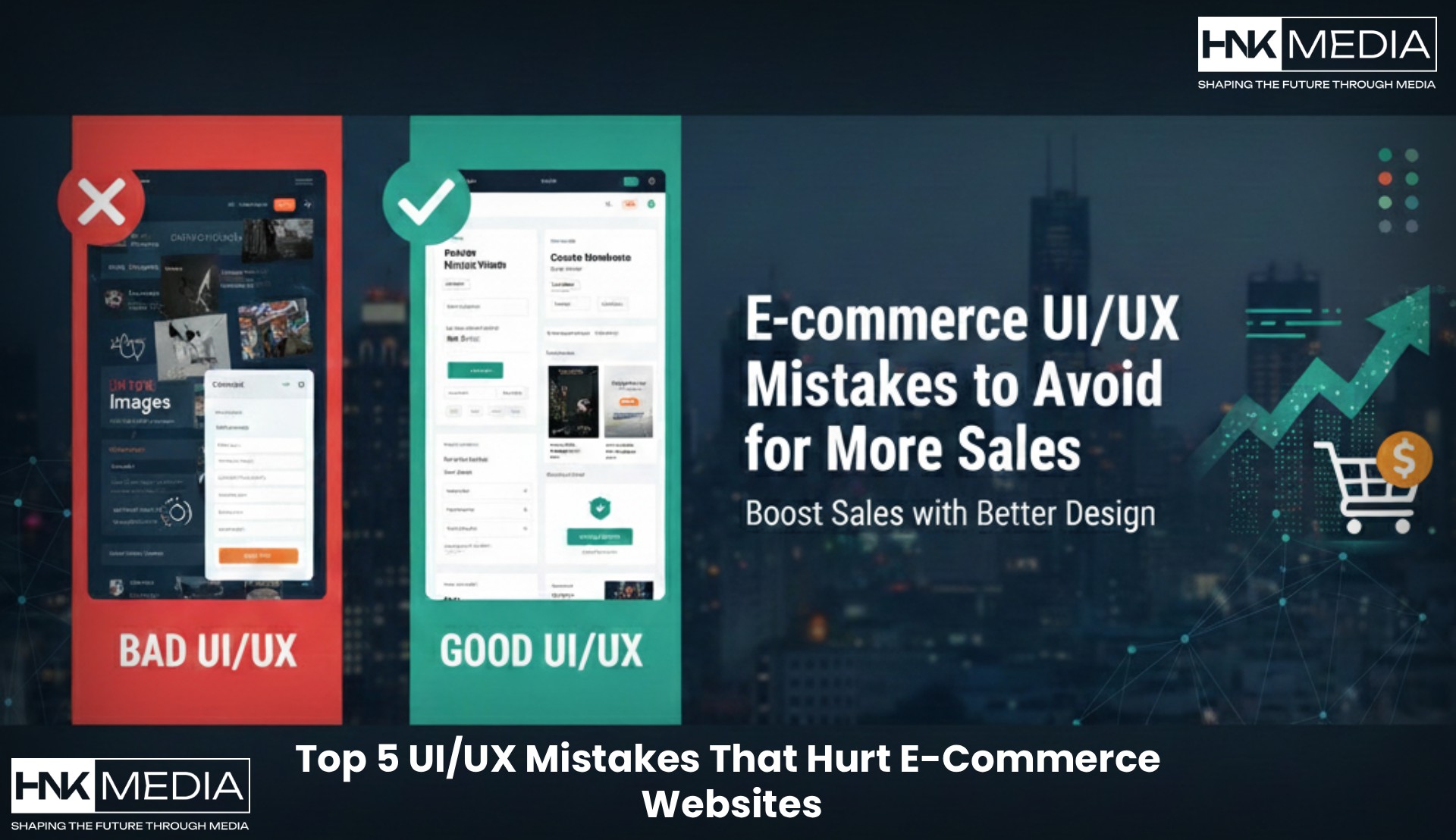
Top 5 UI/UX Mistakes That Hurt E-Commerce Websites (and How to Fix Them)
Published on December 12, 2025 by Sanaullah Khan
Introduction
E-commerce is booming, but many websites lose customers due to poor user experience. Slow load times, confusing navigation, or cluttered layouts can frustrate users and hurt sales. Understanding UI UX mistakes e-commerce websites make is the first step toward improving your online store. In this blog, we’ll explore the top 5 mistakes, how to fix them, and why good design matters for your business.
Mistake 1: Complicated Navigation
Example
Many e-commerce sites hide important categories or use confusing menus. Customers struggle to find products quickly.
How to Fix
Use a clear, simple menu structure
Highlight key categories on the homepage
Include a search bar with autocomplete suggestions
Mistake 2: Slow Loading Pages
Example
Large images or poorly optimized code can make pages load slowly, causing users to leave.
How to Fix
Compress images without losing quality
Use a fast hosting provider
Implement caching and lazy loading
Mistake 3: Poor Mobile Experience
Example
Websites that are not responsive frustrate mobile users, who make up over half of e-commerce traffic.
How to Fix
Use responsive design for all devices
Test buttons and forms on mobile screens
Simplify checkout for mobile users
Mistake 4: Complicated Checkout Process
Example
Too many steps or unclear forms in checkout increase cart abandonment.
How to Fix
Simplify checkout to 1–3 steps
Allow guest checkout
Show progress indicators and secure payment badges
Image suggestion: Streamlined checkout interface Alt text: Simplified checkout to fix UI UX mistakes e-commerce
Mistake 5: Inconsistent Visual Design
Example
Using different fonts, colors, and styles can confuse users and reduce trust.
How to Fix
Maintain consistent brand colors and typography
Use uniform buttons and icons
Follow design patterns across pages
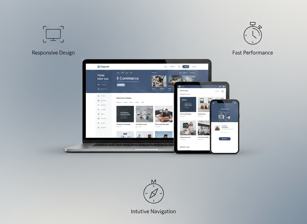
What Good UI/UX Looks Like
Responsive: Works seamlessly on desktop, tablet, and mobile
Fast Performance: Pages load quickly, keeping users engaged
Story-Driven: Layout guides users through products with clarity and purpose
Intuitive Navigation: Customers find what they need without confusion
Why Choosing the Right Agency Matters
Partnering with a professional agency experienced in e-commerce website design Mumbai ensures:
Expert design that boosts conversions
Optimized performance and faster load times
UX solutions tailored to your target audience
Working with specialists saves time, avoids common pitfalls, and improves ROI.
Q1: What are common UI UX mistakes e-commerce websites make? Common mistakes include slow loading, poor navigation, bad mobile experience, complex checkout, and inconsistent design.
Q2: How can UI UX improvements increase sales? Better UX keeps users engaged, reduces cart abandonment, and builds trust, all of which boost conversions.
Q3: How do I choose the right UI/UX agency? Look for experience in e-commerce, proven results, and a portfolio of responsive, user-focused designs.
Q4: Is responsive design really necessary? Yes. Over half of online shoppers use mobile devices, so responsive design is critical.
Conclusion
Avoiding UI UX mistakes e-commerce sites make can dramatically improve sales and customer satisfaction. From navigation to checkout and visual consistency, small fixes can make a big difference.

 Call 24/7 Hours+91 87677 68614
 Send Us Mail info@hnkmedia.com