In branding, there is always a defining moment — a moment where everything shifts from uncertainty to clarity.
At HNK Media, that moment usually happens when a founder sees their new brand identity for the first time. It is rarely loud or dramatic. More often, it is quiet. There is a pause, a moment of processing, and then a sentence we hear again and again:
“This feels like us. This is what we always wanted, but could never express.”
That reaction is not just emotional validation — it is strategic confirmation. It tells us that the brand has moved from being visually inconsistent and disconnected to becoming aligned, intentional, and meaningful.
This case study is about one such transformation — a Mumbai-based jewellery brand that did not change its product, pricing logic, or core offering, but fundamentally changed how it was perceived.
And in today’s market, perception is not secondary. It is central to growth.
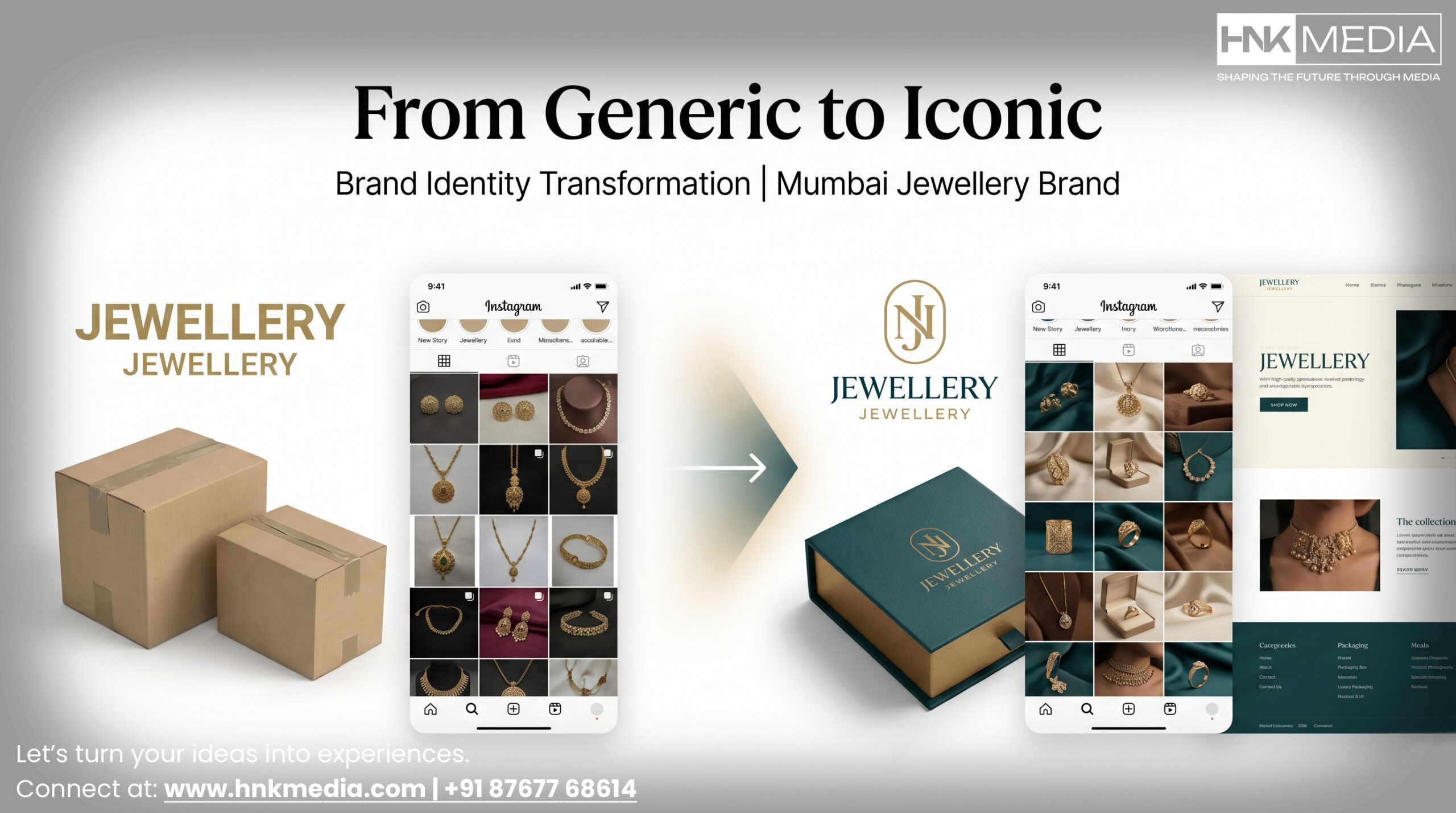
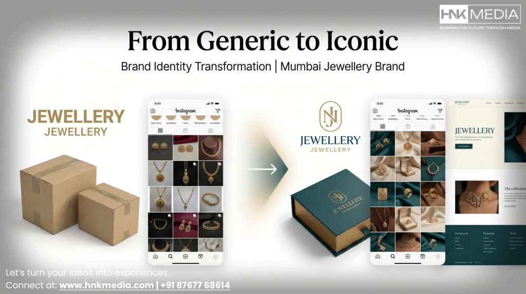
The Before: What Generic Looks Like
When this jewellery brand from Mumbai approached us, they were not a new business. They had already spent four years building their operations, refining their craftsmanship, and understanding their customers.
On the surface, everything seemed right.
They had:
- Skilled craftsmanship developed over time
- Unique, handcrafted jewellery pieces
- A founder deeply involved in design and product quality
However, despite these strengths, the business was not scaling at the expected pace. Customer acquisition was inconsistent. Repeat purchases were limited. And most importantly, the brand was not commanding the premium it deserved.
When we audited their brand presence, the disconnect became immediately visible.
Their identity lacked coherence and intention.
The logo appeared generic, almost templated, without any distinctiveness or recall. It did not communicate luxury, heritage, or craftsmanship — all of which were core to the product.
The website lacked narrative depth. It relied on stock imagery, which diluted authenticity. Instead of showcasing real craftsmanship, it presented a surface-level aesthetic that could belong to any brand.
Their Instagram presence was inconsistent. There was no unified visual language — no consistent color system, no typography discipline, no storytelling framework. Each post felt isolated rather than part of a larger brand story.
Packaging, which is a critical touchpoint in jewellery, felt purely functional. It lacked emotional value. It did not create anticipation, delight, or a sense of occasion.
This created a fundamental misalignment.
👉 The product communicated quality.
👉 The brand communicated mediocrity.
And in a digital-first decision-making environment, customers do not experience the product first — they experience the brand first.
This meant the business was losing customers not because it lacked quality, but because it failed to signal that quality effectively.
The Discovery Phase
Before any visual changes were made, we entered what we consider the most critical phase of branding — discovery.
At HNK Media, we approach branding as a process of uncovering, not inventing. The goal is not to impose a design direction, but to extract what already exists within the business and articulate it clearly.
This phase extended over two weeks and involved multiple layers of research and interaction.
We began with the founder.
Understanding the founder’s intent is essential because brands, especially in categories like jewellery, are deeply personal. We explored her motivations, her design philosophy, her inspirations, and the emotional experience she wanted her customers to feel.
Simultaneously, we conducted a structured competitor analysis. This included both Indian and international jewellery brands, allowing us to map the visual and strategic landscape.
We studied:
- Common design patterns in the category
- Color usage trends
- Typography styles
- Positioning strategies
This helped us identify areas of saturation and opportunities for differentiation.
In parallel, we analyzed customer behavior.
We asked:
- What makes a jewellery brand feel premium?
- What visual cues build trust?
- What emotional triggers influence purchase decisions?
This was not guesswork — it was pattern recognition based on market behavior.
The synthesis of this research led to a clear strategic direction.
The brand needed to feel:
- Premium, but not intimidating — accessible luxury
- Handcrafted, but not rustic or outdated
- Feminine, but not overly decorative or cliché
- Rooted in Indian heritage, but expressed in a contemporary way
The target audience was clearly defined — an urban, design-aware woman aged 25–35, based in cities like Mumbai, Delhi, and Bangalore, who values aesthetics, identity, and meaning in her purchases.
Key Insight
The most effective brand identities are not created in isolation.
They emerge from a combination of:
- Founder vision
- Market context
- Customer expectation
The role of a branding agency in Mumbai is to bring these elements into alignment.
The After: Building the Visual Identity System
With a clear strategic foundation, we moved into execution.
The focus was not on isolated design elements, but on building a cohesive system — one where every visual component reinforces the same narrative.
The identity was structured around three core pillars:
These pillars acted as decision filters for every element.
Logo Design
The logo moved away from generic symbolism towards a custom-designed typographic system.
Instead of literal motifs, we incorporated subtle influences from traditional Indian design language — reinterpreted in a modern form.
This ensured:
- Originality and uniqueness
- Cultural depth without visual heaviness
- Flexibility across platforms
Color Palette
The earlier palette lacked distinction.
We introduced a refined system:
- Aged gold for richness and legacy
- Ivory for softness and balance
- Deep teal for contrast and memorability
This combination created a visual identity that stood out within the jewellery category.
Typography System
Typography became a defining element rather than a supporting one.
We selected:
- A serif font with character and warmth for storytelling
- A clean sans-serif for clarity in product communication
This created a balance between emotion and functionality.
Photography Direction
The transition from stock imagery to custom photography was transformative.
We conducted an art-directed shoot in Mumbai, focusing on:
- Material textures
- Craftsmanship details
- Natural lighting
The aim was to make the product feel real, tactile, and valuable.
Packaging Experience
Packaging was reimagined as part of the brand story.
We designed:
- Embossed letterpress boxes
- Premium materials
- A layered unboxing experience
This elevated the perceived value of the product and reinforced the brand’s positioning.
👉 Explore branding services:
https://www.hnkmedia.com/our-services/branding-and-graphic-design-company-in-mumbai/
The Results After 90 Days
The impact of the redesign was measurable and immediate.
Within three months:
- 68% increase in website traffic driven by Instagram
- 40% improvement in follower growth rate
- 25% increase in average order value
What is important here is not just the numbers, but what they represent.
The product remained unchanged.
The pricing increased.
The demand still grew.
This clearly demonstrates that perception directly influences value.
What Makes a Brand Redesign Successful?
Not all rebrands succeed, and the reasons are often consistent.
From our experience in Mumbai, failures usually stem from:
- Strategy being replaced by personal preference
- Lack of consistency across touchpoints
- Rushed timelines without proper discovery
Successful rebrands, on the other hand, are built on:
- Clear strategic alignment
- Consistent execution
- Patience in process
Why Branding Matters More in 2026
Modern consumers do not evaluate products in isolation.
They evaluate:
- Visual identity
- Brand story
- Overall experience
In categories like jewellery, branding significantly influences perceived value.
A strong brand allows businesses to:
- Command premium pricing
- Build trust quickly
- Create emotional connection
Without it, even high-quality products struggle to stand out.
❓ FAQs
What does a branding agency in Mumbai typically offer?
A branding agency provides a complete identity system including logo design, color strategy, typography, visual guidelines, packaging, and brand positioning.
How long does a professional brand redesign take?
A structured branding process usually takes 3–6 weeks, depending on the depth of research and execution.
Why is branding critical for jewellery brands?
Jewellery is driven by perception and emotion. Strong branding enhances perceived value and increases customer willingness to pay.
What is included in brand identity design?
It includes logo, colors, fonts, photography direction, packaging design, and overall brand guidelines.
How does branding impact business growth?
Branding influences trust, differentiation, and pricing power, all of which directly impact revenue and scalability.
Final Thoughts
At HNK Media, we believe branding is fundamentally about clarity.
Most businesses already possess something valuable — a strong product, a unique story, or a clear intent. The challenge is not creating value, but expressing it effectively.
This jewellery brand did not transform because it changed what it offered.
It transformed because it changed how it communicated.
Clarity led to trust.
Trust led to conversion.
Conversion led to growth.
If your brand does not reflect your true value, your business will always operate below its potential.
👉 Start your brand transformation:
https://hnkmedia.com/contact-us/
 Call 24/7 Hours +91 87677 68614
 Send Us Mail info@hnkmedia.com